The letter above, in two separate images, is the one
circulated to CPA members. It seems clear and innocuous enough but is startling
in its deceit. The reality is much simpler. The independent editor has been
removed and has not been given the choice to return. The new 'guest' editor is
a CPA member and, I believe, former chair of the CPA council. The editorial,
far from being 'no longer in-house' is about as 'in-house' as it could get. The
notion of a 'guest' here is meaningless since there is no editor, as such, to
invite the guest. Moreover, and, arguably, even more worrying, there is no
mention whatsoever of the writing, editorial, or publishing experience of any
of these people comprising this new, collective, editorship. The appointment of
Jack Doherty as the new 'guest' editor has now been announced on the Ceramic
Review Facebook page. The first comment it attracted sums it all up nicely:
'The maffia (sic) strikes again.' The first comment to arrive on my share
of the document above was, 'What worries me is that the same (one or two)
people are now in charge of who gets into the CPA, who gets into Ceramic Art
London AND what is published in Ceramic Review.' Quite. I wouldn't argue
with a single word of either of those two comments.
Tuesday, 17 September 2013
Monday, 16 September 2013
We Are Ceramic Review! An open letter to the CPA regarding the future of CR
You may have heard - either from Bonnie herself or from other sources - that Dr Bonnie Kemske's contract as Editor of Ceramic Review was recently terminated by the Craft Potters Association. No new editor has been appointed. There are no adverts so far posted seeking a new editor. There appear to be no plans, as yet, to appoint a new editor, and, as things stand at the moment, there is nothing on the CPA website concerning these upheavals at Ceramic Review. Moreover, most CPA members know nothing of these changes. The only member of the CPA council that I have spoken to 'didn't know enough about it' to discuss the issue with me.
** Latest update ** CPA have now informed their members that the Jack Doherty will be the first guest editor but there is still no news on the long term plan for an editor as far as I understand.
In addition to this, we know that promotion of Ceramic Review abroad has been terminated and the focus of the magazine is now to be national only.
A small group of us have written the following open letter to the CPA calling for an Extraordinary General Meeting so that we can put our concerns to them directly. You may have many more questions you would like to ask.
Please take a look at the letter here below, which we plan to send to the CPA council with a list of signatories, and, if you agree and would like to add your name, please send an email to weareceramicreview@gmail.com with a YES as your subject line and your name as the message - with any comments you may wish to make, by midnight Friday 20th September. Please also email or share this post via twitter or facebook to anyone you think might also like to add their name. 116 people have so far added their name via email and many more via facebook. Don't forget to send the email or let me know via fb by Friday 20th!
Many thanks from The C Word
Dear Craft Potters Association Board Members,
We write to express our deep disappointment at the recent removal
of Dr Bonnie Kemske as editor of Ceramic
Review.
We feel strongly that, under her editorship, the magazine
has taken on a new lease of life. Over the last three years we have welcomed
the publication’s broader perspective, particularly enjoying the international
dimension, and the inclusion of a wide variety of ceramic production. The range
of articles about industry, studio pottery, installation work, sculpture, and
public and community art projects, have provided an excellent overview of the
breadth of production and the scale of ambition that defines our field.
It is this mix, combined with the international coverage,
that gives Ceramic Review its
considerable, and currently unparalleled, national and international status.
Our shared concern is that the broad-based appeal of Ceramic Review, its inclusive,
democratic, and international content, and tone of open debate, is set to
become increasingly conservative and narrow. This would be a great shame. At
best, these are very challenging times for magazines. Narrowing the Ceramic Review remit will, almost
certainly, reduce its readership and threaten its survival.
Many of us are CPA members, Ceramic Review subscribers and contributors as well as readers. We
are all stakeholders in the Ceramic
Review enterprise. The welfare and future success of this magazine affects
us all. We urge you to retain a progressive and inclusive
agenda for Ceramic Review, under an independent editorship.
We would welcome an opportunity to
discuss these issues further and call for you to hold an extraordinary general
meeting for that purpose.
Signed:
Saturday, 2 February 2013
The SCUB Manifesto: The C Word reports from a literary hinterland
The C Word has recently taken up membership of the Society
for Cutting up Books. No, this is not the militant wing of a dodgy political
pressure group, it is a celebration of that Ur moment when exasperation becomes
the creative act that results in the taking up of a Stanley Knife to slice
through the spine of a very fat book.
Let me explain. Scubbing is the act of cutting along the
length of the spine of a large, heavy paperback - either a normal ‘cheap’ paperback or one of the glossy
text-book sort – and dividing it into smaller, lighter sections, thus creating
a number of portable booklets rather then one book which is so heavy you can
barely lift it off the shelf. The scubbed sections can then be placed in those
nice transparent ‘pockets’ with holes punched down the side and placed in a
file for safe-keeping. When taking the tube, bus, a train or just for reading
in bed, you need take only one of the sections which is light enough to carry.
This vastly increases your chances of reading the book, since, in its original
published form, it was too heavy to be taken out of the house and too heavy to
read in bed. Let’s face it, how many of us lead the sort of life where we can
‘read in the library’ or ‘in the drawing room?’ Quite. Scubbing, in short, is
what you do with books which are not available on Kindle. Where art books are
concerned, that’s most of them.
The first book I scubbed was Glen Adamson’s ‘The Craft
Reader,’ a magnificent book if only one could hold it up longer than five
minutes. It seemed particularly appropriate that this should have been the
first. Adamson’s book is published in sections (1-7), – all sewn together in
one volume – daft, but no matter. It is an anthology of craft writing. Section
1 deals with the ‘how-to’ writing. In his introduction to the section he
writes:
As is obvious from the sheer volume of
instructional publications produced annually, most are never put to direct use.
Books are given as gifts or bought on impulse, page through and left on the
shelf.
He goes on to say that the voluminous heaps of unread
literature have an additional purpose to that intended which is to attest to
the aspirations and identity of the would-be reader. Bearing this in mind, and
considering that I had only just started reading the book, how could I allow
myself to leave this book, unread – or at least unfinished- on the shelf simply
because it was too heavy to read on the tube? So began my membership of SCUB.
That was almost three years ago. Since then I have scubbed a Lonely Planet
Guide to Iran, Salman Rushdie’s, ‘Midnight’s Children,’ and now, I’m happy to
say, James Joyces’ ‘Ulysses’ has been so honoured – neatly cut into three manageable
morsels and may well be cut again if I need to study another section at close
range, as it were. (See the The C Word Supplement for more on this – it concerns
my next body of ceramic work, Molly’s Odyssey.) So, my aspirations
to being a well-read potter, and the instructions in Adamson’s book as to how
to achieve that, are now assured. One more thing: The Craft Reader IS a magnificent book. Much has been said already of its vast scope, its richness and its breadth of understanding of what craft is. I will just add it's worth getting for the excerpt from George Sturt's, 'The Wheelwright's Shop,' alone. Read this and weep! And not just for reasons of the writing. The following extract is from Adamson's introduction to the excerpt:
Sturt had a basic conviction that it was
only through direct, physical experience that one could understand workmanship,
or even raw materials: ‘My own eyes know because my hands have felt, but I
cannot teach an outsider the difference between Ash that is “touch as
whipchord”, and Ash that is “frow as a carrot” or “doaty”, or “biscuity”.’
Ends
Ends
Saturday, 24 November 2012
The Last Sane Man, Michael Cardew, Modern Pots, Colonialism and the Counterculture, Tanya Harrod, Yale University Press, 2012
-->
Introduction
Michael Cardew, (1901-1983), was, and still is, one of the
most highly regarded potters of the 20th century. Along with Bernard
Leach, he pioneered both the aesthetics and the technical know-how of the
modern studio pottery movement, or what we now call ceramics.
Tanya Harrod’s detailed journey through his life and work is
an epic sweep across the social, political, and art history of the 20th
century. Her biography opens before Cardew was born with a brief look back at his
ancestry, introducing his well to do, highly educated, upper-middle class
family, and closes after he dies, looking forward to the impact of his extraordinary
legacy which crosses well beyond the borders of craft pottery and the arts to
embrace anthropology, politics, and the ecological and alternative movements of
the 20th Century.
Early life and love
Cardew was born and raised in Wimbledon, South-West London,
with regular family holidays at a seaside house in Staunton in Devon, where he
grew to love the traditional English slipware pottery still being made at nearby
Fremington. As a teenager, while doing agricultural work with his school during
WWI, he experienced his first male love and subsequent rejection. While his
love of slipware flourished, his love of other men became highly conflicted and
was largely closeted throughout his life; he longed for ‘normality,’ for marriage
and children.
He studied Classics at Oxford but then rejected the expected
career of a socially privileged, scholarly male and, instead, pursued his love
of pottery. He trained with Bernard Leach in St. Ives and, within a few years, set
up his first pottery, retrieving the abandoned kiln and workshops at Winchcombe
in Gloucestershire. Here he had success in both his pottery ambitions and in
love but, nonetheless, longed to return to Cornwall. It was at Winchcombe that
he met and married
Mariel Russell and where their three children were born. Here too he developed
his life-long preference for ‘austerity.’ He rejected what he referred to as
‘bourgeois’ affectations, preferring the sometimes harsh conditions of the
struggling rural potter.
Cornwall and West
Africa
In 1939, he left Winchombe with Mariel and the children to realise
the dream and set up the Conrnwall pottery at Wenford Bridge. This saw the
beginning of a series of disastrous firings and relentless, unforgiving
struggle. With the onset of WWII Cardew decided to leave Mariel and the children
to cope with the inconclusive chaos at Wenford and, in 1942, got a posting to
Ghana, then called the Gold Coast and still a British Colony. Here, at
Achimota, he set up what would be the first of three pottery workshops in West
Africa. It was also here that he met and formed a lasting relationship with a
young man called Clement Kofi Athey. After Achimota, he went with ‘Kofi’ to Vume
on the Volta River, and set up the second workshop. The third was near Abuja,
in Northern Nigeria.
For five years, the failed firings continued
but, at the point of transferring to Abuja, with an adjustment to the kiln
design, they began to yield much needed success. It was also in Abuja that
Ladi Kwali, an immensely gifted Nigerian potter, using traditional handbuilding
methods, joined Cardew and his team and learnt to use the wheel and work with
stoneware and glazes, while also doing with her own work. Ladi Kwali later
became a major star, touring the USA with ‘Kofi’ and Cardew and also visiting
the UK. Cardew left Nigeria in 1963, after independence, and returned
to Wenford Bridge. Mariel was living in London now but regularly visited Wenford. 'Kofi' also came to Wenford
for some time but returned to Ghana and Cardew continued to visit him there.
Over the next twenty years, Wenford Bridge became a magnet for aspiring studio
potters from all over the world and Cardew did numerous speaking tours to
USA, Canada, New Zealand, and Australia.
Conclusion
Michael Cardew’s working life spanned sixty years, (1923-83),
in Britain and West Africa. Tanya Harrod navigates this vast and complicated
historical terrain with formidable political agility. She applies forensic critical
scrutiny to the colonial context of working, personal and romantic
relationships as well as to the wider social contexts. We learn about Nigerian
contemporary art movements and evolving independence movements in both Ghana
and Nigeria. Cardew’s tours of the USA and Canada and his relationships there
are all explored in the context of the civil rights, anti-Vietnam war, gay
rights and ecology movements.
We hear the voice of Clement Kofi Athey from his letters and
through others who knew him. He does not appear only as a colonial ‘subject’
but as an active player with his own concerns and priorities. We also hear
the opinions and memories of the villagers at Vume and Abuja from interviews
and site visits. We hear from Mariel’s friends, colleagues and associates, as
well as from her own letters and diaries. Harrod brings an admirably cool head
combined with considerable compassion to the complicated tangle of both
homosexual and heterosexual relationships, enabling a fully rounded picture of
all concerned to emerge.
Cardew eschewed industrial processes, insisting on
developing a pottery ‘from the ground up,’ starting with making and firing the
kiln bricks, digging up local clay and grinding rocks for glaze materials. Undaunted, Harrod
deftly picks her way through the details of craft pottery - the firing
temperatures, the nature and feel of the clay, the machinery and general grub
and grit as well of the science and aesthetics of the business.
This is painstaking historical research combined with
fluent, inspired storytelling. It’s a glorious book, one that will live near
you and will be read and reread, argued over and discussed. Buy it new - second
hand copies will be rarer than hen’s teeth!
Tuesday, 25 September 2012
On The Record: writing my own art history

Introduction
Writing one’s own art history is always going to be risky; it’s subject to human memory, which is notoriously unreliable. Fortunately, I am a diary writer and an avid collector of exhibition catalogues so there is at least some documentary evidence for the claims I might make. The following is an account of the artists, exhibitions and movements which have had a significant effect on my work and on the way I think about ceramics.
Marc Chagall
An exhibition of paintings (1967-77) by Marc Chagall, at Palazzo Pitti in Florence in 1978 was the first to make a real, memorable impact on me. I went to see it time and again over the course of a month that summer. They looked beautiful and made sense to me, more so, if I was honest, than much of the rather grandiose religious art that I was supposed to be studying at the time. They seemed to be telling a story, though what that story was, was wholly obscure to me at the time.
Later, studying ‘fine art,’ which at that time was painting,
drawing and print-making, at Camberwell School of Art and Craft, (1981-85), my
depraved and superficial taste for such ‘illustrational, decorative’ works as
these was dismissed as woefully unserious and uneducated. I was introduced to
Bonnard and got a season ticket to an exhibition of paintings by Pisarro,
apparently these were the acceptable face of figurative art which Chagall,
curiously, wasn’t. I was painting landscapes at this time, but I was a village
girl and now lived in London and hadn’t learnt to love the London landscape
yet. I was getting interested in its people though and, in particular, their
stories which were so different from mine but with so many meeting points.
Kathe Kollwitz
An exhibition of graphic works by Kathe Kollwitz at Kettles
Yard, in Cambridge, in 1982 was the next ‘Ah – YES!’ moment. These were
intimate, everyday stories about ordinary people and their extraordinary struggle
to survive. It was a struggle which Kollwitz shared, in that she inhabited the
same place and time and lived through the same wars, but from a distance: she
was comparatively well off and her subjects are mostly people profoundly
oppressed by poverty. Even so she seemed able to capture something of their
lives, experience, concerns, and above all, their humanity. They were not
objectified as ‘The Poor.’ Again my interests were at odds with those of the
institution: ‘Manifesto,’ hissed the head of department, with unrestrained
contempt.
Soviet Porcelain
In 1984 the Museum of Modern Art in Oxford in partnership
with the Crafts Council in London, mounted an exhibition entitled, 'Art into
production: Soviet Ceramics and Textiles.’ The ceramics, Soviet Porcelain, was
breath taking. The Imperial porcelain factory in St. Petersburg had been requisitioned
by the Bolsheviks, in 1917, and hordes of young, idealistic, revolutionary
artists eagerly joined the factory to paint the porcelain ‘blanks.’ These works
were explicitly propagandist and magnificently designed and painted. Here was
an extraordinary moment in art history, quietly overlooked by established art
historical discourse, which fused revolutionary fervour with art – or rather
craft and industrial production – but it was painters, Kandinsky, Goncharova,
Popova and the constructivists, Suetin among others, who were the main
exponents of this work. I remember thinking I had found the answer to all my
questions about how to proceed as an artist. I was, by then, working towards my
final degree show, but in the back of my mind, simmering quietly, was a growing
understanding that, contrary to the tired dogma of the art school I attended,
there was a way to bring political activism and art together. I had seen two
examples in as many years, both recognised by highly respected and
authoritative art institutions and both had stood the test of time.
Taking action
After four years at Camberwell, I understood that painting
was not for me, but what to do? I had learnt which medium I didn’t want to use,
but not which ones I did. I continued drawing. After graduation I joined a
women’s life drawing group. There were five of us. Buoyed up with voluminous feminist
idealism and determined to rip through every last thread of the patriarchal
fabric, we decided that the notion of the artist’s model was a grotesque
misogynist conspiracy and we would boldly challenge the entire concept and, in
so doing, rock the history of art to its roots. Thus it was, that in the top
room of the squat in Peckham, in summer 1985, the five of us got naked and drew
each other drawing each other. I do still have the documentary evidence. It is
in my shed and there it will stay. Charmingly absurd though it may seem in some
respects, it was an immensely productive time as well as being probably the
best life class I have ever attended – we were meeting for at least a year. The
history of art plainly didn’t register so much as shiver never mind anything
else but, for my part, a new chapter of art practice opened up.
The Think Black Line and so much more
The life-class was on Monday. On Wednesdays we went to exhibitions. ‘The Thin Black Line,’ curated by Lubaina Himid, was at the ICA that year. The first exhibition of the work of black women, it was, both explicitly activist, on the part of the artists, something which we well understood, and ‘notoriously tokenistic,’ on the part of the institution. Either way, it was a hugely exciting exhibition. Himid’s magnificent cut-outs, (Tate Britain), and Sutapa Biswas’ now famous image, ‘Housewives with Steaknives,’ (Tate Britain), burnt themselves into my consciousness and have never departed. Four years later, ‘Along the lines of Resistance,’ also an explicitly feminist show, introduced me to the work of Nina Edge, the first contemporary potter I came across whose work truly excited me. It looked good, was colourful, decorative, ornamental and told stories – interesting ones. Lubaina Himid later became a much needed adviser for my PhD. One of the most significant aspects of this strand of contemporary art practice was its non-hierarchical position on craft, shaped largely by anti-imperialist / post-colonial politics combined with feminism.
By means of a mildly eccentric life-drawing class, and a
series of important exhibitions of work by contemporary feminist artists, I had
found a way to be an artist that could embrace both ceramics, which I now
loved, and other peoples’ stories, which I also loved and understood in their
wider, socio-political contexts. The repeated mantra I had received at art
school which stated that ‘art and politics don’t mix,’ was plainly bunkum. The
key was a sophisticated, educated understanding of all the elemental parts:
art, narrative, and the social impact of politics on the lived experience of
people.
The Country Potter
It was September 1985, with the new term starting, that one
of the life-class women announced she was going to a pottery class and asked if
any of us would come with her. We all went but I was the one that continued for
next three years. I had found the medium that was, without question, the right
one. In 1989 I moved to Oxford and started an apprenticeship at Winchcombe Pottery
with Ray Finch. To say the least it was a culture shock. I was back in the
village. It was a sharp reminder of why I had moved to London. The landscape
was like something out of Thomas Hardy at times but so were the social
attitudes – it was sometimes depressing, other times highly entertaining.
Yorkshire - and the Hungarians
The subculture of ceramics was also a culture shock. This
was an art practice apparently untouched by feminism or, indeed, any of the
social movements or art discourses which had become part of my social and
artistic norm in London in the 1980s. So here I was, first in Oxford, then in
Yorkshire, in the 1990s, wondering in which part of the 20th century
I had landed. My nine years in Yorkshire were highly productive in terms of my
own work but something of a desert in terms of influences. Ceramicist Paul
Scott, who has pioneered and popularised the development of printmaking
techniques for potters, was an important teacher and introduced me to the work
of Hungarian maker Maria Geszler. A visit to Hungary and to her workshop
included a trip to Szentendre where I found and was captivated by the work of
Margit Kovacs, (1902-77). The museum in Szentendre holds almost all of her work
which has not, to date, been seen in this country. The Zsolnay Museum in Pecs, home of the Zsolnay Factory, introduced me to the work of the estimable Therese and Julia Zsolnay, the Zsolnay sisters, in whose name I produced a collection of work: 'Collection for the Zsolnay Sisters,' (1999).
Arguably, my most important encounter during my time in Yorkshire was with Lubaina Himid and the late Maud Sulter, (1960-2008), then both living nearby, in Preston. I was meeting two of the most important and inspirational women of my art-life. Maud was opening a new gallery in London, 'Rich Women of Zurich,' and invited me to do a show there. There gallery was short lived but the friendship endured until Maud's death in 2008. They helped to take me out of the then somewhat parochial world of craft pottery and return me to the wider art world from which I had come. It was in their gallery that I showed 'Collection for the Zolnay Sisters,' my first London solo show in a private gallery.
My one other memorable ceramic encounter of this time was
when my sister sent me a newspaper cutting, a review of an exhibition by
someone called Grayson Perry who was showing pots at Anthony D’offay Gallery in
London. ‘Someone’s stolen your ideas!’ she exclaimed in the accompanying note.
There was just one tiny picture. My heart sank and I felt sick. I worried about
this apparent incursion for days. After the initial shock, however, I quite
quickly came to the conclusion that there was nothing I could do about it even
if it were true, which, I suspected, it probably wasn’t, and resolved to
continue with what I was doing, and let life take its course. I also resolved
not to look at the imposter’s work, and that included looking at pictures of
his work. A couple of years later, in 1999, I had a show in London at a gallery
called, Rich Women of Zurich, (directors Maud Sulter and Lubaina Himid,) and
two people came in wanting to meet Grayson Perry. They had looked through the
window and thought my work was his. I was told there were a couple of his pots
in the Crafts Council Gallery down the road and the following day I went to see
them, in person, as it were. The personal encounter was hugely reassuring. They
were completely different. They were big painted pots, and had printed images
on them, which mine did too at that time, but there the similarity ended.
Back to London
The move back to London in 2001 was prompted by a trip to
Australia in summer1999 where I met Edmund de Waal, who was giving the key-note
speech at a conference. He talked about Bernard Leach in ways I recognised, in
the same way that Nina Edge had talked about Leach-influenced pottery in an
essay in Feminist Art News in 1988[1]
and, rather more damningly in, ‘Your Name Is Mud,’ (Sulter, 1990: 155-67). Ceramics,
it seemed was beginning to acknowledge the twentieth century, just in time for
the twenty-first.
In the last ten years, I have encountered a few truly
inspiring contemporary ceramicists. They include, Tehran based, Iranian artist,
Bita Fayyazi, whose work I first saw in Contemporary Iranian Art, at the
Barbican, 2001, and who I now count as a good friend; Klara Kristalova, whose magical
fairy-tale, figurative work is represented in London by Alison Jacques; and
Israeli / Australian potter, Avital Sheffer, represented by Beaux Art in England
and numerous outlets in Australia. I am eternally grateful to Grayson Perry for
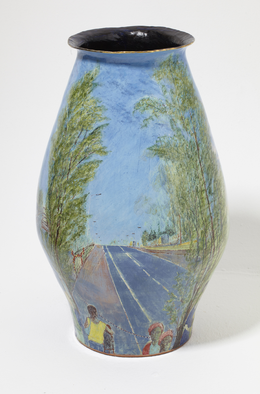
his success since, I suspect, it has opened doors for me. It has certainly made
it much easier to tell people that I make pots with pictures, (as opposed to
patterns), painted on them, and that I show this work in art galleries. There
was once a time, not long ago, when that was considered inconceivable, it is
now regarded as almost normal, a process of change in which he has played a significant
part alongside increasingly open minded curators and institutions.
Wednesday, 15 August 2012
A Wedding and a Funeral: two pots in my forthcoming show at Francis Kyle Gallery
-->
Images from top:
1. St. Mark of the Farm (left) and Wedding Procession (right)
2. St. Mark of the Farm
3. St. Mark of the Farm
4. Wedding Procession
5. Wedding Procession
6. Wedding Procession, (detail)
Introduction
Images from top:
1. St. Mark of the Farm (left) and Wedding Procession (right)
2. St. Mark of the Farm
3. St. Mark of the Farm
4. Wedding Procession
5. Wedding Procession
6. Wedding Procession, (detail)
Introduction
Two pots, both based on classical storage jar shapes and
painted around the circumference as a frieze, depict verdant landscapes, dominated
by tall trees against blue-grey, English skies. Both feature teams of white,
plumed horses, swanky cars and quantities of bling. They appear similar at
first glance but the events taking place within the landscapes could hardly be
more different. ‘Wedding Procession,’ commemorates the marriage of Prince
William to Catherine Middleton in April 2011. The event and the way it was
mediated affirmed the continuity of monarchy and the power of the state. ‘St.
Mark of the Farm,’ is a record of the funeral of Mark Duggan, who was shot by
police on August 4th 2011, precipitating four nights of rioting.
Duggan’s story is still extensively mythologised. He is, at once, the Hero:
‘people looked up to him;’ Villain: ‘Starrish Mark, leader of the notorious
Star gang;’ Saint: ‘he was a lovely guy, everyone knew him, he wouldn’t hurt a
fly;’ and Martyr: ‘a fallen soldier.’ His funeral, all in white, with white
lilies on the casket like the virgin bride, was in September, six months after
the wedding. The similarities in appearance were beguiling but they served only
to emphasise the vast social difference. It was a spectacle of inequality, a
mis-matched pair that bookended the summer and seemed to define the troubled
social politics of the time.
Wedding Procession
The Royal Wedding was a brilliantly choreographed spectacle
and a thoroughly crafted conceit, where sharp contrasts and rigorously
controlled separation together defined the illusion of a shared national drama.
The pot form provides a stage where the separation and
contrasts become visible. We cannot see the bride in her carriage because she
is obscured by trees. At the event itself, the public were separated from
royalty by both the physical barriers and the carefully mediated story, a richly
embroidered fairy tale. The public are ‘below stairs’ on the pot - below the
outermost curve. The separation is emphasised by the receding perspectives
above and below the curve. The wedding procession itself takes place on the
upper section among the trees, reaching up towards the skies.
This was the first of the English royal weddings to
encounter and be captured by popular mass communication. The public are
depicted photographing the event, a forest of outstretched arms pointing their
camera phones towards the glimpses of procession visible through the trees. Of the images uploaded to the internet, the most
photographed part of the wedding was the runaway horse whose journey was
captured at every stage. The official ‘central’ figures were marginal by
comparison.
To make the pot, I looked at an endless stream of
flickering, moving, transitory and, often, ephemeral images and painted and
fired a selection of them into a material that lasts for thousands of years –
icing on the fictional cake perhaps.
St. Mark of the Farm
Set in and around Tottenham and the Broadwater Farm estate,
St. Mark of the Farm shares many visual and narrative elements with Wedding
Procession. The trees, the procession and the white, plumed horses suggest a
wedding, but this is a funeral. It is a deeply personal, family event where
sorrow and loss mix with pageantry, spectacle and a suppressed public interest.
Duggan’s story is also highly fictionalised, the romance of the ‘villain’ who
dies a saint. The landscape, which embraces this drama is, par excellence, a
romantic urban construction, simultaneously historic and contemporary. It is
the landscape through which I walk daily to work, from my house in Tottenham,
right by ‘the Farm,’ as the estate is known locally, to my studio in Wood
Green.
Standing in Broadwater Farm, which wears its inner city
notoriety like a badge of honour, is a confusing experience, particularly at
dawn or dusk in winter when it feels mysteriously rural. At these times, this
large estate often falls silent. The Moselle river, which was once reduced to a
foul, concrete lined ditch in the 1960s, is now being retrieved with help from
a lottery grant, and snakes along the bottom of the willow-tree lined valley
with Alexandra Palace glittering in the distance. The last of the day light
glows pink in the damp, starting-to-flood, valley floor and the moon appears
above the roof tops to the south. At these times you can almost hear the cows
mooing – it was a dairy farm until well into the mid-twentieth century and was
then converted to allotments. Because of the flooding, there were no buildings
until the estate was built in 1965 and the Moselle was forced, reluctantly,
underground. Like all rivers it refuses to stay there and reappears every
winter in the form of floods which, in turn fill with geese, gulls and
migrating birds, adding the extraordinary rural illusion. Mark Duggan grew up
on this estate. His family are still there.
The pot uses all the elements of the landscape and
exaggerates and idealises them to enhance the narrative. The idealised Mark,
the saint, the ‘family man,’ is suggested by the evening landscape with the
river, which is borrowed from the background landscapes of pre-renaissance,
religious paintings. The three distinct scenes are those of the birth and early
life, the death, and the funeral. The death landscape is Tottenham Hale, a low
horizon line, bleak, empty and soulless, a reality of the place itself and an
inescapable metaphor. The Farm is, co-incidentally, the lowest point in the
landscape for some miles around, so the only way out of the estate is up hill. The
blocks of flats were built on giant concrete stilts, with aerial walkways
instead of streets because of the flooding and these too have become part of
its notoriety and mythology. The cemetery at Wood Green, where Duggan is
buried, is, by contrast, on the brow of a hill, commanding a fine view across
north London. It is here, at the funeral in white, that Duggan completes his
transformation from villain to hero to martyr and finally to saint.
The Role of Landscape
I made the pots to remember and to witness the events they
depict. I chose to emphasise the image of the landscape in which they occurred as
a metaphor for the construction of social myths. What constitutes an urban or
rural landscape cannot be taken for granted. Urban landscapes can be much more
verdant than their rural counterparts and are often, wealthier, less
industrialised and more nurtured. The rural ‘idyll’ is more apparent in the
wealthier parts of London, with its carefully selected native English trees and
artfully tended ‘wild’ areas, than in small-town England, where industrial
farming is in a state of decline and rural poverty results in neglect. The
Royal Wedding took place in central London, the centre of power and wealth and
the seat of government and monarchy. In this setting, it also resembled a
magnificent mythic hunting scene from a Renaissance tapestry – a resemblance I
sought to repeat on the pot by introducing exotic birds in the trees and
flattening the perspective.
Mark Duggan’s funeral took place in one of the poorest parts
of London. One might have expected a landscape of bleak estates, broken windows
and impressive graffiti. But this kind of grit-chic is another romantic urban
construction, generated in the studio for music videos. There is certainly nothing
like it in Tottenham in late summer. On the contrary, the traces of its rural
and prosperous past are splendidly visible at this time, in both parks and
streets, where the vast mature Willows, Oaks and Ash dominate the landscape. Wood
Green also carries the memory of a prosperous suburban history. ‘Arcadia
Gardens’ is not a fiction – or not on the pot anyway. That really is the name
of the road.
Landscape does, however, become a part of the political
analysis of spectacular inequality if we compare the image of the Royal couple
in the Aston Martin in the Mall with the remarkably similar image of Tottenham
Hale, where Duggan was shot. The low horizon lines are similar and both images
are framed with abundantly leafy trees. While the Aston Martin and balloons are
the decorative feature of the royal landscape, the road at Tottenham Hale
appears to go nowhere and the only decoration is the cascade of synthetic
flowers adorning the railings, a shrine to the ‘fallen soldier,’ or
rehabilitated ‘saint.’
Thursday, 19 July 2012
Collect 2012
I have reviewed Collect twice in its illustrious history – ok, once, (2008) and a brief comment at the end of another post, (2009). I then forgot about it until last year when a kind soul reserved complimentary tickets for me and I managed to be away the entire weekend. I have been inattentive, to say the least.
My first visit to Collect was also its first outing. It was
at the V&A and still had the feel of ‘tarted –up’ clutter. It was too
crowded – with stuff I mean - and the standard was inconsistent. After another
year at the V&A, it moved to the Saatchi gallery near Sloane Square. It was
a bold and, in spite of my acerbic comments in 2009, an inspired move. By all
accounts it has improved steadily since and, while I cannot comment on any of previous
shows, 2012 was a triumph.
The Saatchi gallery is a beautiful, elegantly proportioned
space, graced with high ceilings, magnificent wooden floors and plenty of
natural light. It is the perfect venue for the display of beautiful objects.
The exhibiting galleries all had plenty of room so the work displayed had room
to breathe and the audience had enough space to walk around it. In practice,
this means that the viewer moves much more slowly around the exhibition than is
the case in more crowded venues. It allows one time to think and reflect of the
work.
Collect is a serious selling show. That is its primary
purpose. It is also a showcase but makes no pretence to being either
representative or a survey show. The galleries select their highest quality
work and the organisers, by bringing in collectors and media, facilitate the
bringing of ‘museum quality’ craft to its potential buyers. In doing so, they
are starting solve one of the most persistent and seemingly intractable
problems of craft: how to bring the goods to market.
In the process, every aspect of craft exhibiting and
selling, from display to the attitude of the gallerists, has become palpably
more professional. Collect is also truly international now. It is probably the
only high-end, international applied arts fair in Europe. The Scandanavian
galleries and artists are particularly well represented and are also a breath
of fresh air. There is a strong focus on the ‘upcycled’ work, where ‘trash’ or
discarded ceramics, in particular, are remade, reinvented and become entirely
new works. In most cases this is the only chance Londoners have to see this kind
of work. Craft in London is otherwise parochial, poorly exhibited, (with one or
two notable exceptions,) and largely very conservative.
La Ceramica Gallery was a welcome new addition, bringing the
work of internationally acclaimed Nicaraguan potters to London for the first
time, and Hanart TZ was the first Chinese gallery to show at Collect, bringing
ceramics and laquer work - the
latter is a particularly exciting development since, as far as I know, we have
not seen contemporary laquer work in this country before. If I were handing out
prizes, it would go to the Japanese gallery, Yufuku. All of the work on this
stand was breathtaking. Every piece shone with the sheer strength and
conviction of its own presence. Graceful, classical, poised - even when
entirely un-classical – it was all work you wanted to come back to again and
again, just to make sure you really had seen such a thing. The ceramic works of
Nakamura Takuo were unforgettable. The colour and patterning was reminiscent of
early 17th Century Japanese silks, glistening, strong colour but
subtle – mostly tertiary colours - and faultlessly composed with a painterly vision. How anyone
brings together soft ripe pinks, sombre but glowing maroons, lime-ish greens
edged in something darker, and bright ultramarine, is beyond me. I could gaze
on this work for the rest of my life and, as soon as I have any money at all,
I’m going to make sure I can.
Subscribe to:
Posts (Atom)