Wednesday, 15 August 2012

A Wedding and a Funeral: two pots in my forthcoming show at Francis Kyle Gallery

-->


Images from top:
1. St. Mark of the Farm (left) and Wedding Procession (right)
2. St. Mark of the Farm
3. St. Mark of the Farm 
4. Wedding Procession
5. Wedding Procession
6. Wedding Procession, (detail)

Introduction

Two pots, both based on classical storage jar shapes and painted around the circumference as a frieze, depict verdant landscapes, dominated by tall trees against blue-grey, English skies. Both feature teams of white, plumed horses, swanky cars and quantities of bling. They appear similar at first glance but the events taking place within the landscapes could hardly be more different. ‘Wedding Procession,’ commemorates the marriage of Prince William to Catherine Middleton in April 2011. The event and the way it was mediated affirmed the continuity of monarchy and the power of the state. ‘St. 
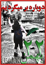
Mark of the Farm,’ is a record of the funeral of Mark Duggan, who was shot by police on August 4th 2011, precipitating four nights of rioting. Duggan’s story is still extensively mythologised. He is, at once, the Hero: ‘people looked up to him;’ Villain: ‘Starrish Mark, leader of the notorious Star gang;’ Saint: ‘he was a lovely guy, everyone knew him, he wouldn’t hurt a fly;’ and Martyr: ‘a fallen soldier.’ His funeral, all in white, with white lilies on the casket like the virgin bride, was in September, six months after the wedding. The similarities in appearance were beguiling but they served only to emphasise the vast social difference. It was a spectacle of inequality, a mis-matched pair that bookended the summer and seemed to define the troubled social politics of the time.

Wedding Procession

The Royal Wedding was a brilliantly choreographed spectacle and a thoroughly crafted conceit, where sharp contrasts and rigorously controlled separation together defined the illusion of a shared national drama.

The pot form provides a stage where the separation and contrasts become visible. We cannot see the bride in her carriage because she is obscured by trees. At the event itself, the public were separated from royalty by both the physical barriers and the carefully mediated story, a richly embroidered fairy tale. The public are ‘below stairs’ on the pot - below the outermost curve. The separation is emphasised by the receding perspectives above and below the curve. The wedding procession itself takes place on the upper section among the trees, reaching up towards the skies.

This was the first of the English royal weddings to encounter and be captured by popular mass communication. The public are depicted photographing the event, a forest of outstretched arms pointing their camera phones towards the glimpses of procession visible through the trees. Of the images uploaded to the internet, the most photographed part of the wedding was the runaway horse whose journey was captured at every stage. The official ‘central’ figures were marginal by comparison.

To make the pot, I looked at an endless stream of flickering, moving, transitory and, often, ephemeral images and painted and fired a selection of them into a material that lasts for thousands of years – icing on the fictional cake perhaps.

St. Mark of the Farm

Set in and around Tottenham and the Broadwater Farm estate, St. Mark of the Farm shares many visual and narrative elements with Wedding Procession. The trees, the procession and the white, plumed horses suggest a wedding, but this is a funeral. It is a deeply personal, family event where sorrow and loss mix with pageantry, spectacle and a suppressed public interest. Duggan’s story is also highly fictionalised, the romance of the ‘villain’ who dies a saint. The landscape, which embraces this drama is, par excellence, a romantic urban construction, simultaneously historic and contemporary. It is the landscape through which I walk daily to work, from my house in Tottenham, right by ‘the Farm,’ as the estate is known locally, to my studio in Wood Green.

Standing in Broadwater Farm, which wears its inner city notoriety like a badge of honour, is a confusing experience, particularly at dawn or dusk in winter when it feels mysteriously rural. At these times, this large estate often falls silent. The Moselle river, which was once reduced to a foul, concrete lined ditch in the 1960s, is now being retrieved with help from a lottery grant, and snakes along the bottom of the willow-tree lined valley with Alexandra Palace glittering in the distance. The last of the day light glows pink in the damp, starting-to-flood, valley floor and the moon appears above the roof tops to the south. At these times you can almost hear the cows mooing – it was a dairy farm until well into the mid-twentieth century and was then converted to allotments. Because of the flooding, there were no buildings until the estate was built in 1965 and the Moselle was forced, reluctantly, underground. Like all rivers it refuses to stay there and reappears every winter in the form of floods which, in turn fill with geese, gulls and migrating birds, adding the extraordinary rural illusion. Mark Duggan grew up on this estate. His family are still there.

The pot uses all the elements of the landscape and exaggerates and idealises them to enhance the narrative. The idealised Mark, the saint, the ‘family man,’ is suggested by the evening landscape with the river, which is borrowed from the background landscapes of pre-renaissance, religious paintings. The three distinct scenes are those of the birth and early 
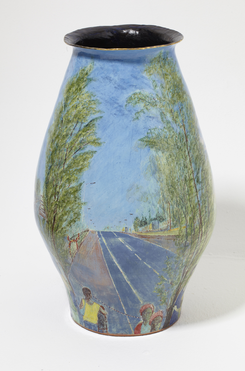
life, the death, and the funeral. The death landscape is Tottenham Hale, a low horizon line, bleak, empty and soulless, a reality of the place itself and an inescapable metaphor. The Farm is, co-incidentally, the lowest point in the landscape for some miles around, so the only way out of the estate is up hill.  The blocks of flats were built on giant concrete stilts, with aerial walkways instead of streets because of the flooding and these too have become part of its notoriety and mythology. The cemetery at Wood Green, where Duggan is buried, is, by contrast, on the brow of a hill, commanding a fine view across north London. It is here, at the funeral in white, that Duggan completes his transformation from villain to hero to martyr and finally to saint.

The Role of Landscape

I made the pots to remember and to witness the events they depict. I chose to emphasise the image of the landscape in which they occurred as a metaphor for the construction of social myths. What constitutes an urban or rural landscape cannot be taken for granted. Urban landscapes can be much more verdant than their rural counterparts and are often, wealthier, less industrialised and more nurtured. The rural ‘idyll’ is more apparent in the wealthier parts of London, with its carefully selected native English trees and artfully tended ‘wild’ areas, than in small-town England, where industrial farming is in a state of decline and rural poverty results in neglect. The Royal Wedding took place in central London, the centre of power and wealth and the seat of government and monarchy. In this setting, it also resembled a magnificent mythic hunting scene from a Renaissance tapestry – a resemblance I sought to repeat on the pot by introducing exotic birds in the trees and flattening the perspective.

Mark Duggan’s funeral took place in one of the poorest parts of London. One might have expected a landscape of bleak estates, broken windows and impressive graffiti. But this kind of grit-chic is another romantic urban construction, generated in the studio for music videos. There is certainly nothing like it in Tottenham in late summer. On the contrary, the traces of its rural and prosperous past are splendidly visible at this time, in both parks and streets, where the vast mature Willows, Oaks and Ash dominate the landscape. Wood Green also carries the memory of a prosperous suburban history. ‘Arcadia Gardens’ is not a fiction – or not on the pot anyway. That really is the name of the road.

Landscape does, however, become a part of the political analysis of spectacular inequality if we compare the image of the Royal couple in the Aston Martin in the Mall with the remarkably similar image of Tottenham Hale, where Duggan was shot. The low horizon lines are similar and both images are framed with abundantly leafy trees. While the Aston Martin and balloons are the decorative feature of the royal landscape, the road at Tottenham Hale 
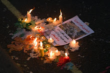
appears to go nowhere and the only decoration is the cascade of synthetic flowers adorning the railings, a shrine to the ‘fallen soldier,’ or rehabilitated ‘saint.’

Thursday, 19 July 2012

Collect 2012


I have reviewed Collect twice in its illustrious history – ok, once, (2008) and a brief comment at the end of another post, (2009). I then forgot about it until last year when a kind soul reserved complimentary tickets for me and I managed to be away the entire weekend.  I have been inattentive, to say the least.

My first visit to Collect was also its first outing. It was at the V&A and still had the feel of ‘tarted –up’ clutter. It was too crowded – with stuff I mean - and the standard was inconsistent. After another year at the V&A, it moved to the Saatchi gallery near Sloane Square. It was a bold and, in spite of my acerbic comments in 2009, an inspired move. By all accounts it has improved steadily since and, while I cannot comment on any of previous shows, 2012 was a triumph.

The Saatchi gallery is a beautiful, elegantly proportioned space, graced with high ceilings, magnificent wooden floors and plenty of natural light. It is the perfect venue for the display of beautiful objects. The exhibiting galleries all had plenty of room so the work displayed had room to breathe and the audience had enough space to walk around it. In practice, this means that the viewer moves much more slowly around the exhibition than is the case in more crowded venues. It allows one time to think and reflect of the work.

Collect is a serious selling show. That is its primary purpose. It is also a showcase but makes no pretence to being either representative or a survey show. The galleries select their highest quality work and the organisers, by bringing in collectors and media, facilitate the bringing of ‘museum quality’ craft to its potential buyers. In doing so, they are starting solve one of the most persistent and seemingly intractable problems of craft: how to bring the goods to market.

In the process, every aspect of craft exhibiting and selling, from display to the attitude of the gallerists, has become palpably more professional. Collect is also truly international now. It is probably the only high-end, international applied arts fair in Europe. The Scandanavian galleries and artists are particularly well represented and are also a breath of fresh air. There is a strong focus on the ‘upcycled’ work, where ‘trash’ or discarded ceramics, in particular, are remade, reinvented and become entirely new works. In most cases this is the only chance Londoners have to see this kind of work. Craft in London is otherwise parochial, poorly exhibited, (with one or two notable exceptions,) and largely very conservative.

La Ceramica Gallery was a welcome new addition, bringing the work of internationally acclaimed Nicaraguan potters to London for the first time, and Hanart TZ was the first Chinese gallery to show at Collect, bringing ceramics and laquer work  - the latter is a particularly exciting development since, as far as I know, we have not seen contemporary laquer work in this country before. If I were handing out prizes, it would go to the Japanese gallery, Yufuku. All of the work on this stand was breathtaking. Every piece shone with the sheer strength and conviction of its own presence. Graceful, classical, poised - even when entirely un-classical – it was all work you wanted to come back to again and again, just to make sure you really had seen such a thing. The ceramic works of Nakamura Takuo were unforgettable. The colour and patterning was reminiscent of early 17th Century Japanese silks, glistening, strong colour but subtle – mostly tertiary colours -  and faultlessly composed with a painterly vision. How anyone brings together soft ripe pinks, sombre but glowing maroons, lime-ish greens edged in something darker, and bright ultramarine, is beyond me. I could gaze on this work for the rest of my life and, as soon as I have any money at all, I’m going to make sure I can.

Monday, 23 April 2012

Edmund de Waal at Waddesdon - (or come dine with me)


 Who would have the chutzpah to take on a Rothschild ‘chateau’ in Berkshire? Why an Ephrussi of course! Or a potter. Edmund de Waal is still a potter although many now know him as a writer and, oh the romance, a descendent of an outrageously exciting family of bankers and art collectors who competed with the Rothschilds and knew everyone who was anyone. Now he has quietly infiltrated the very inner sanctum of the competition and sneaked his own work in among their fabulous collections.

Breezing through the first of a trail of rooms, blazing with gold twirls and red velvet, and feeling a strong sense of belonging in a matter of seconds – self delusion is encouraged in these houses – I just kept going until I was brought up short in what was, by now, my dining room. I was expecting guests apparently. The table was bristling with red and pink roses, there were marble cherubs clinging to the mantelpiece, gorgeous embroidered curtains and mirrors stretching up to the ceiling, topped off with paintings of naked beauties, just in case there was any doubt about what sort of dinner party this would be. The reds and gold of the carpet glowed warm in the gloom. Turning to check all was as it should be, I noticed the plates piled up on a side table backed by another vast mirror which reflected itself a thousand times with all its plates in the mirror opposite. A great many guest were coming then. There was a rogue gold plate in the pile I noticed. Someone important was expected.

Returning to the breakfast room, I looked again at the small vitrines of rather delicate porcelain cylinders regarding a weighty nanny-goat, suckling her kid. On the other side of the room was a similarly solid looking peacock, heavily built in porcelain. It had a slight tear among the carefully moulded feathers which seemed to bring it alive. The animals are MINE by the way, NOT de Waal’s.

These interloping vitrines, beautifully constructed and unyieldingly rectangular with fine, straight lines, were dispersed among the rooms as though silently commenting on the situation in which they found themselves. One of my favourite desks in the Grey drawing room, a drop-front with gorgeous blue Sevres roundels inlaid, had acquired a set of inky pots, dark and mottled gold. They glimmered faintly in the dim light. I noticed two more of these on the desks on the other side of the room. Writing paraphernalia in the form of trays of shallow inky dishes were also placed on the mighty, Russian imperial writing desk, and four more had been secreted into its shelves. Eat yer heart out Putin! You’ll never know true greatness -Pah! Couldn’t even sit at a desk like this.

There are more, many more visiting vitrines. Frosted secrets, still untold, a collection of promises, doubtless unmet, are scattered among the collection of magnificent French furniture, Dutch paintings and Venetian glass. And of course there’s a riot of porcelain of the opulent kind as well the kind in vitrines.  Once there, you wont want to leave, and it shouldn’t be too hard to find a place to hide, should you wish to stay.    

Thursday, 26 January 2012

Emmanuel Cooper, 1938-2012


Emmanuel Cooper, potter, writer, historian, teacher, friend and mentor, died on the 21st of January, 2012.  He was, and will remain, one of the central figures in British twentieth century ceramics. He was the alchemist who transformed studio pottery from its marginal position with of a handful posh English blokes making wholemeal brown stoneware and a sprinkling of precious pottery ladies pursuing a wholesome hobby in the garden shed, to the fully fledged, vibrant, professional craft that it now is, thriving in the art world and imposing itself on the reluctant consciousnesses of the literati and media-ristocracy.

In 1970, with Eileen Lewenstein, he founded Ceramic Review, which evolved into one of the most respected art magazines on the market with an international readership and profile. As a historian and glaze technician he was second to none. Go into the studio of any working potter and you will find at least one of his books, if not the dictionary of glaze recipes, then one of the histories. He did not restrict his research and writing to ceramics. His publications include: ‘Fully Exposed: Male Nude in Photography,’ (1995), ‘People’s Art: Working Class Art from 1750 to the Present Day,’ (1991), and, ‘The Sexual Perspective: Homosexuality and Art in the Last 100 Years in the West,’ (1994).  He brought this extensive knowledge to his writing and teaching. Under his influence ceramics became a discipline able to flourish in a contemporary art context. Without Emmanuel Cooper, we probably would not have either Grayson Perry or Edmund de Waal, at least not as we know them. Both, doubtless would be successful artists and de Waal, in particular, would still be a potter and writer but their work would have so much less meaning and resonance. Perry would not have his adversarial opposite which would deny his work much of it’s ‘charge,’ (his word), and de Waal, too would lack an opposing context – his would be a much lonelier body of work.

Cooper was born in 1938 and during his early years, during the post-war era, studio pottery, under the auspices of Bernard Leach, grew steadily. It become fashionable in the1960s when the quasi-rustic, back to nature aesthetic was part of an anti-establishment life-style. Numerous potters associations sprung up, sharing information and resources, each with its own newsletter, annual conference and exhibition. There was a corresponding growth in availability and quality of materials as the industry reached out to the burgeoning market of hobbyists. Classes mushroomed and potters acquired an increasingly professional training. In the midst of this maelstrom of activity, was Emmanuel Cooper who had that rare and extraordinary gift of being able to connect across the full range of makers and designers that emerged during this period. From the most conservative makers of garden and tableware, toiling in barns in the rural shires, to the most outrĂ© and rarefied of post modern academicians, producing dusty ‘installations,’ and museum ‘interventions,’ he inspired equal respect and affection in us all.

Cooper the potter was tenaciously 'urban.' He developed a range of glazes tailored to the needs of urban surroundings, in particular the use of a compact electric kiln. Not for him the roar, smoke and melodramatics of the wood-fired beasts beloved by rural potters. I will always think of Emmanuel Cooper pots as either bowls or jugs, but primarily as shapes which could show off his latest glaze like some kind of grand new apparel, a volcanic swathe of blistering, bubbling colour - usually a monochrome but rarely the same thing twice.  Delicate and elegant, they were and are instantly recognisable as his.

Emmanuel Cooper was true democrat, a unifier among the cliques and factions which so often proliferate in marginal subcultures. He diversified the discipline in all senses of the word, bringing together industry and studio, academics and makers, and above all, consistent with his egalitarian activist politics, he brought in people from all backgrounds ensuring that it could grow beyond the effete circle of posh blokes in sheds which characterised the early years, and become the highly respected art form it now is, one in which we can all be proud to participate. In a word, he is irreplaceable. In his case, the cliches are right: it is the end of an era and we  probably will not see his like again, but that does not need to be a reason to mourn. Rather we can celebrate his colossal legacy and build on it. There could be no better way to honour his extraordinary life and work.

Tuesday, 20 December 2011

The Tomb of the Unknown Craftsman: Grayson Perry at the British Museum

'Ooooh how I love those stout German stoneware jugs,' I crooned, leaning into the display case to admire every twirl of oak leaf and branch on the rough brown surface. Then other decorative motifs swam into my vision: bloody Alan Measles again. I'd been had. It wasn't a 'genuine' stout German pot, it was a genuine Grayson Perry, pretending to be one. Round the display case I went and found the ribbon's of text, stamped into the clay surface using old printing letters, setting out a ludicrous rhyme which I no longer recall, but it made me laugh out loud. The best thing about this show is that you often can't tell at a glance, which works are 'proper museum objects' and which are Grayson Perry's museum objects, and the other best thing about this show, if that's possible, is that it will make you laugh out loud many times, and it's not often you can say that about contemporary art, let's face it. Alan Measles, that ubiquitous teddy bear, cavorts with angels and devils, with soldiers and horses. He is a knight astride his mount, standard and shield at the ready, he is a votive object in a shrine, with erect penis with a flower in it, holding hands with Claire, dressed, as she so often is, in headscarf and A-line skirt. Both of these works are cast in metal but the shrine has a ceramic tile at the back, painted with the image of a female black smith. Perry uses iron for most of the metal work in this show- it is the material of the forge, of industry and of craft for industry, a concept Perry expresses well, not least in the first exhibit, one of his motorbikes, which is outside the gallery with a shrine on the back with another teddy bear in it.

The selection of the Museum's votive and spiritual objects is magnificent and Perry's works respond to  these objects effortlessly and work their way in among them, threading his own mad story of the life of  his god-bear and his attempt to establish himself as a contemporary deity. He encounters everything from religious tourism to celebrity, 24 hour news and social networking and scowls at all of it. The pots are as gorgeous and as funny as they always are, mixing that lucid graphic hand with layer upon layer of collaged imagery, dense and dark at times. The final piece of the show, the boat with the casts of crafted objects and the bottles of sweat, blood and tears lashed to its mast, is a fabulous object, (in all senses of the word,) cast in Iron, lyrical and mythical, utterly convincing and deeply eccentric all at once.

I had thought that Grayson Perry's best show to date was The Charms of Lincolnshire, where he created a collection of works responding to a rural, agricultural and domestic museum collection. The Tomb of the Unknown Craftsman continues and develops this theme but with a much greater emphasis on the talisman, the votive and the ritual object. It probably tops the earlier show. It's wonderful, moving and funny. Go and see it!

Saturday, 24 September 2011

Origin - in Turbulent Times

The Autumn Equinox has brought with it an atmospheric change. An economic year of bumbling along, sort of hoping things might improve has suddenly blown up into a maelstrom of recrimination, anxiety, market chaos and talk of recession round two. Origin, now in the beating heart of trendy art-world East London, oozed confidence by contrast. It hummed with activity which, I hope, was an indicator of people deciding to spend money on well made, long lasting objects they would love.

Origin is vast, overwhelming in some respects. You can't look at everything unless you have all day and a substantial reserve of energy. I go there for the ceramics and, to some extent I notice the metalwork and furniture too. Jewellery, textiles and sundry other weird-looking accessories interest me not one jot and, these days, with limited time, I simply edit out of my vision all that does not immediately engage. This year, I looked only at the ceramics and, for the first time, bought things. It's my new project -  kick-starting the economy.

Sophie Woodrow's porcelain dream-world beasts made an enticing reception committee. With hollow eyes and strangely clad in unlikely costumes, they stood on their hind legs, those that had them, and stared and I stared back. An owl with antlers, covered in miniature toad-stools, a bull with a lowered head and large bow, hedgehog-like creatures and rabbity things - all called out mournfully for attention. It was astonishingly affecting and surprising too  -  a relief not to encounter more of the vicious bunnies intended to subvert or shock but, instead, something quietly and genuinely moving.

Aneta Regel-Deleu had a gorgeous collection of new work - weird bone-like structures, half live, human, and growing but also surreal and anything but human, in their skins of ferocious-coloured glaze - matt powdery pink, bright orange gloss and vicious yellow.

Then came the tableware, which is where I got out my debit card. First stop, Sun Kim, her sleek, oatmeal coloured stoneware has evolved into a fine collection of supremely elegant tableware. I sulked when I found no mugs with handles. 'A disastrous firing,' she explains, and promises me mugs at her forthcoming open studio. I make a mental note to reserve enough money for one of her teapots too. On to Linda Bloomfield's stall where a lovely new lemon yellow glaze attracts me and I buy a mug, tall and straight. She's also developed a new mushroom coloured glaze. 'Men didn't buy my work until I made the 'grey,' she explains.' She's talking to a woman from London Potters Association who's taking copious notes and questioning every potter closely, particularly about sales. Origin, according to Linda, delivers the goods. Hooray! So I'm not the only one determined to kick our sluggish economy up the ass then.

Finally, it's Chis Keenan. Lately he's been making delicious Temmoku glazed work with sky blue insides and sure enough - he has mugs. Mugs! Proper mugs with handles - he's one for the Japanese aesthetic which is all very fine if you're Japanese but I'm English, very English, and I like a good stout mug for tea, brown tea - and I've always had my doubts about blue with brown. However, to my surprise, I find myself selecting a mug with a handle and buying it. Someone had asked him to put a handle on a tea-bowl apparently - and damn sound advice it was too. I don't hold with this tea-bowl nonsense. The colour is gorgeous. Ok, so the Temmoku is a wee bit marmitey and the handle's a bit fussy - Keenan's a tad over-crafted for my tastes but this is proper mug-shaped mug and I wasn't going to pass up on the opportunity - I do love that black/ blue mix. I needn't have worried about the blue / brown tea look. It works perfectly. The tea just reaches up near the rim where the black of the Temmoku is bleeding into the blue and it's just exactly right. Looks like a turbulent Autumn day in fact. Slurrrp. That's better - and silky smooth too, enough to calm the most jittery nerves, even those of the markets.


Wednesday, 17 August 2011

Johara Dance Company present: Hoochie Coochi Girls


Hoochi Coochi Girls, the latest production from Johara Dance Company, is a complex, evocative, and technically brilliant extravaganza, showcasing contemporary Middle Eastern dance at its best. Forget those uncomfortable, attenuated bellydancing performances you’ve seen in restaurants and nightclubs or even the polished displays of a handful of moves in music videos; Hoochi Coochi Girls mines a rich seam of dance history and treads a vast and ambitious cross-cultural terrain, challenging comprehensively the limitations imposed by the notion of an ‘authentic’ Middle Eastern dance. The show encompasses classical Egyptian, Oriental and folkloric dances in part one, through contemporary urban Hiphop, to interludes of early twentieth century cinema and music hall, to some magical nightclub fusions in the closing scenes.

Sailors and Sequins

The show is in four parts with the opening scene set in a port in Alexandria. It is a bright, cheerful good natured, dance banter - a theatrical portrait of dockside life. Awash with glitter and colour, a series of set pieces and solos tell a story of life at the social margins. We encounter women with baskets of wares to sell, women with bodies to sell, women with airs and graces to disapprove of everyone else, and a group of disreputable sailors who provide comic interludes and lewd commentary. Stunning group dances with full ‘corps-de-bellydance’ ensemble, faultlessly choreographed and performed, set the standard: a sharp and punchy Malaya Lef contrasts with the liquid elegance of the veil dances while a music-hall style hornpipe by the sailors adds variety and theatricality which shapes the entire evening.

Loss and Longing

The second part, Gypsy Life and Immigrant Love, sees a dramatic change of mood and a complete departure from the norms of bellydance. A darker, heavier atmosphere produces a series of dances that are variously spiky, angry, bored, steeped in sorrow and, finally, fist-clenchingly optimistic – that desperate hope of the brutally oppressed. The defining scene is The Factory in which a line of dancers produce and reproduce each other’s moves in sequence, imitating the monotony, relentlessness and sheer bone-shattering exhaustion of the sweatshop. Startlingly original, it choreographs boredom and resentment, an emotional territory largely untouched by dance productions and studiously avoided by bellydancers. On either side of The Factory, are two dances exploring loss, yearning, grief and confusion. Bellydance meets Flamenco Jondo in Josephine Wise’s gorgeously intense performance of ‘I long for Jerusalem,’ a passionate expression of longing traditionally sung by Spanish Jews, and, rural America meets central Baghdad in Two Kids, which portrays the lives of two Muslim children, both shut indoors away from life-threatening hostility. Performed with extraordinary tenderness and grace and by Mayelle Roger and Trish Rapley-Giles, this deceptively simple dance was both deeply touching and immensely evocative. The section ends with a ebullient Bollywood Hiphop fusion choreographed by Nuxya Nereisidos, and performed with razor-sharp precision.

Hollywood Spectacle

Part three, The Golden Age of the Movies, (see video of Arras performance at 1.20) is a return to classical oriental dance and costumes but now the entire performance is imbued with a golden haze of soft-focus, cinematic fantasy. It opens, in spectacular contrast to the preceding section, with a  romantic, dewy-eyed performance by the whole cast, in glistening white, fairy-princess style costumes and enormous smiles.  Margaret Krause’s choreography, which defines this section, captures the enchanted, dreamworld innocence of the period to perfection.

Masques and Swords

The fourth and last part, Masked Ball, performed in electric blue and pink with black masks, retrieved the accented spikiness of some of the earlier dances. The centre piece of this section was a breathtaking sequence of pure theatre which silenced the audience as ‘Kali’s Militia,’ (video at 1.47) choreographed by Gwen Booth, completely reinvented the traditional sword dance, introducing mystery, magic and fury as the dancers lined up and the swords took on the look of a terrifying, mythic beast. More fluid though no less terrifying was the moment the group circled menacingly, each dancer raising her curved sword above her head such that the blades themselves appeared to dance, rising and falling in sequence like wave, driven by their own fierce beauty. It was one of those unforgettable theatrical moments that will live in my memory forever.

What sets Hoochi Coochi Girls apart from all other bellydance shows I’ve seen, and places it in a class of its own, was the originality and scope of the choreography, the immense visual contrasts, the ambitious emotional range, and the flawless conviction with which all the dances, solos, duets and set pieces were performed. The grand finale, a mass of colour, light and splendour, drew extensively on the techniques of Sorcha Ra, Johara’s resident fire dance and poi expert and a recent addition to the company. A mix of veils, vast flaming fans, and flags, or ‘poi,’ swirled through the air, closing a truly audacious and unforgettable performance.