Many Iranian Diplomats Seek Political Asylum
Probably the shortest post I've ever written, but do click on the link and read the article - it's short, succinct and revealing. I was prompted to follow it up myself after news emerged that the Iranian diplomatic representative in Norway resigned his post and petitioned for asylum there.
The Persian 2 English site is an excellent way of getting additional information about the situation in Iran in English.
Friday, 15 January 2010
Tuesday, 12 January 2010
Comparatively Speaking: Reviewing The Reviews
Introduction
There’s something insanely decadent about eating eggs on toast and drinking really classy champagne for supper – I guess breakfast would be more decadent but then I’d just fall over on the ice. Anyway, perhaps this just tells you what a simple soul I really am underneath all the artspeak.
So, it’s January and my sciatic nerve’s still complaining but with nothing like the ferocity of previous months. I write / type standing up – sitting down is still an endurance test – but if it was good enough for Virginia Woolf, it’s good enough for me.
So, The White Rabbit’s got very interested in artists who work in clay and show in swanky or moderately swanky art galleries – which is fine by me because it means I get a troll around London finding out about all this stuff, at least 50% of which I probably wouldn’t get to otherwise and I find that I’m still fascinated by what’s going on, or not going on, in these old West End joints.
So they are still representing, ‘nice painting.’ Nowt wrong with that, you may say, but no point pretending it’s groundbreaking, exciting work with something new or different or especially incisive to say about the world. If Goodman’s work is representative of what they show, then it’s safe to say that they stock, well, ‘safe’ work: sellable, domestic, well-made, - the precise, painting equivalent of Alison Bitton. Sound - Camberwell Grey - 2nd eleven - inoffensive; a nice, moderately flattering mirror in which the bourgeoisie can view themselves. Well, why not? If there’s a market – flog it. Silence, you in the back row, no one mentioned dead horses!
Love Jonsson, ‘Conquered Time,’ 2009, in Skill, (Think Tank 05, 2009): 34.
There’s something insanely decadent about eating eggs on toast and drinking really classy champagne for supper – I guess breakfast would be more decadent but then I’d just fall over on the ice. Anyway, perhaps this just tells you what a simple soul I really am underneath all the artspeak.
So, it’s January and my sciatic nerve’s still complaining but with nothing like the ferocity of previous months. I write / type standing up – sitting down is still an endurance test – but if it was good enough for Virginia Woolf, it’s good enough for me.
East End / West End
I was asked to write a review of Charlotte Hodes work at Marlborogh Fine Art. First the White Rabbit asks me to write about those four artists – Rebecca Warren, (Maureen Paley), Rachel Kneebone, (White Cube), Renee So, (Kate MacGarry), and Klara Kristalova, (Alison Jacques) – who feature this month’s Ceramic Review; then he asks me to review Hodes’ work, at a gallery in Cork St; now I’m to write about Judy Fox, another artist working in clay who is represented by PPOW gallery in New York – doesn’t look especially blue chip but seems to be a fairly standard fine art gallery – also represents the highly esteemed, (by The C Word anyway), Carolee Schneemann, who hales from the 1970s feminist art movement and did some extraordinary performances cleaning floors with her hair among many others. So, The White Rabbit’s got very interested in artists who work in clay and show in swanky or moderately swanky art galleries – which is fine by me because it means I get a troll around London finding out about all this stuff, at least 50% of which I probably wouldn’t get to otherwise and I find that I’m still fascinated by what’s going on, or not going on, in these old West End joints.
The Great Divide
They appear to have frozen in time. I get the impression that the brash, oh so nouveau riche, (perish the thought), YBA, Saatchi / J. Jopling cohort burst into action in, say, 1989, eclipsing Cork street and it’s cohorts forever. They, Cork Street, responded by carrying on just as they always had. They still are. Some are, shall we say, renewing the stock; in other words they’re adding to their collection of artists. Marlborough certainly seems to have a number of dead artists on its lists. It represents highly established and still living artists like Paula Rego, Magdalena Abakanowicz, Frank Auerbach and Maggie Hambling as well as ‘the estate of RB Kitaj,’ Uglow, Pasmore et al. In addition they have an artist by name of Catherine Goodman, with whom I was a student at Camberwell. Imagine my surprise to find that she was still producing EXACTLY the same work she did at Camberwell on the painting degree course 25 years ago. So they are still representing, ‘nice painting.’ Nowt wrong with that, you may say, but no point pretending it’s groundbreaking, exciting work with something new or different or especially incisive to say about the world. If Goodman’s work is representative of what they show, then it’s safe to say that they stock, well, ‘safe’ work: sellable, domestic, well-made, - the precise, painting equivalent of Alison Bitton. Sound - Camberwell Grey - 2nd eleven - inoffensive; a nice, moderately flattering mirror in which the bourgeoisie can view themselves. Well, why not? If there’s a market – flog it. Silence, you in the back row, no one mentioned dead horses!
Charlotte Hodes
So where does Hodes fit in? And how? Well she’s more up to date, I’ll give her that. Faultlessly crafted. No problem there either. Intellectually rigorous –can’t ague with the stuff, it’s absolutely rock solid. Thank goodness you don’t have to like it – but whatever you do, don’t go and see this stuff with a hangover. Or if you must, take a bucket or a lot of alka seltzer, because it IS nauseating. The morning-after-the-night-before colours really don’t help – it’s even got lumps floating about it. Grotesque. And, I’m sorry, but it really is vastly over-crafted. I could find no justification for it. It was, in Love Jonssen’s words, ‘a manifestation of wasted time.’ A harsh judgement, perhaps, but there seemed to be no discernible story, or not one that I really cared about- the faint-hearted feminist narrative is one we’ve seen a thousand times before – and is insipid at best anyway and beyond that – what? There’s no particular beauty either. It’s just ever so well crafted. I did try to convince myself it was some kind of spoof on Donatella Versace and might look well alongside some kind of high fashion home-ware collection, but I didn’t succeed. Psiche Hughes
This is all in immensely sharp contrast to Psiche Hughes work that I bloggged about some time ago. Hughes shows at Francis Kyle gallery down the road, same neighbourhood. No claims can be made here about virtuoso exercises in ceramic materials. It isn’t ‘well crafted,’ but it is exactly as well crafted as it needs to be to say what she wants to say, and it’s not without skill – she certainly understands the difference between colour, local colour and tone – these are old fashioned craft-painting concerns – you see? I’m a wee bit conservative myself as well as being a simple soul. Hughes’ work is not made up of ‘museum pieces,’ forget that, but it is well observed and funny. If I had to choose, yes, I’d take Hughes imitation still-life, ‘bananas in a bowl,’ home with me long before I gave house room to one of Hodes confections. East End
And what of the others, the four who graced the blue-chip East End galleries? I’d love one of Rebecca Warren’s terrifying women in my front room, by the window – that’d give upstairs something to think about. Kistalova’s work I just love, I’d take it with me anywhere and everywhere. The other two I can leave alone. So’s work I found just slightly too pedestrian – predictable somehow and Kneebone’s was just vastly over heated – almost too desperate – ‘look, I am a proper artist, I know all about the Renaissance and Roccocco and I wouldn’t dream of working in anything other than porcelain.’ It protests it authenticity too much – but it’s very early days in her case, she may yet become much more fluent and less self-conscious. Conclusion
What was interesting to me about this little crop of artists who showed in 2009, is that it seems that the concerns and, in particular, the problems of artists working in clay seem to be broadly similar to those of potters working with clay –not when they make pots so much, but when they depart form making pots and start to produce work which suggests they might become part of the wider art world. They have exactly the same struggles with authenticity – but this time it’s ‘art’ authenticity that’s at stake; predictable ways of thinking about something, resulting in a too predictable narrative; and an over-concern with being authentically ceramic and designed, in the case of Hodes. The three who, I felt, had very much found their own voices, namely Kristalova, Warren and, although far less developed, Hughes, were able to identify a way they needed to work with the clay and, in turn, make it work for them. Certainly Kristalova and Warren are absolutely fluent in the ceramic dialect of their choice and it serves them fully, whereas Kneebone, Hodes and So are still, to some extent dominated by it. Kneebone, in particular, is too close to the grammar book and dictionary, but give her another five years, and I hope we’ll see something much more expressive – unless, of course, she becomes increasingly pedantic. Hughes is working with clay in her retirement, so is an entirely different matter. Still, I can’t help feeling that her very extensive understanding of language and of the particular demands of the art of translation give her a very astute and fully understood aesthetic sensibility. Love Jonsson, ‘Conquered Time,’ 2009, in Skill, (Think Tank 05, 2009): 34.
Monday, 14 December 2009
Some Reflections On The British Ceramic Biennial
BCB: Some Reflections On Fresh And Award Winners
I was invited to talk about this blog at a forum organised by the National Association for Higher Education in Ceramics, (NACHE). The intention, as far as I could discern, was to discuss the future of Ceramic education and NACHE’s relationship to it. The only thing I can tell you is that it looks likes it will now have some student representation and that it may well broaden out to include secondary school education. While I was there, however, I was able to have a good look at the Award Winners show and a quick look at Fresh.
The dominant theme of the AWs was undoubtedly pathos, or rather PATHOS – almost overwhelmingly so at times. It was appropriate but bizarrely inconsistent. While half of the work said, ‘I’m in mourning,’ the other half said, ‘Well I couldn’t give a monkey’s. I’m just continuing to reproduce the same stuff I’ve made for the last 30 years,’ – pots about pots and pots about material. Nothing wrong in that you might think and, indeed, there isn’t, it just looked like the selectors couldn’t decide what to do – have a show with a narrative, one which they’d forgotten to mention in advance, or choose what they fancied, mix it up and keep their fingers crossed. They probably would have got away with it if they’d had a couple more rooms to work with but, as it was, all the work was crammed into a too small space, which gave it that singularly unfortunate junk shop feel – which just added to the pathos.
The supreme winner was Neil Brownsword and deservedly so, thankfully – it always makes life easier when you find yourself agreeing with the selectors – and somewhat rare in my case – although, of course, I have no idea who else submitted images of their work, I might well have disputed the initial filter.
Brownsword chose to materialise, or rematerialise, a collection of detritus from Stoke Factories. Beautiful shreds of glazed weird bits of gubbins strewn around a plinth -the plinth was a bit unfortunate- but, as a whole, it was genuinely moving. The was a slow slide show which you couldn’t see because there was too much light, but the bits I did see had their moments- It wasn’t a slide show – it was what happens when you put the camera on a tripod and let it record whatever’s going on in front of it for a while – a series of those shot one day a week over a month or so. Some bits were shot through a wire fence which was particularly affecting.
Paul Scott also went for the pathos narrative using damaged and altered transfers on his industrially produced plates. A simple enough idea and one which communicated well.
The material-culture irony came from Connor Wilson, the ‘satire’ came from Steve Dixon who, unfortunately, decided to wrap himself in a copy of the Daily Mail, and - yes, that’s right, it’s almost too crassly embarrassing to have to write it, but he really did produce a series of pig’s heads with rosettes and little labels so we could identify exactly which politicians they were intended to represent. Moreover, he appears to have cast them from a real pig’s head which, from a distance, makes them look far too interesting to work as satire at all. Never mind. Then there was Philip Eglin – football as religion – no shit – now there’s an original idea.
We had the raku and general crustiness from David- gone- can’t remember his name, -or any of the others come to that. Ken Eastman showed that nice line in bone china, and a factory of some sort produced some SENSATIONAL paperweights, which included the campest looking owl I’ve ever seen. Fab.
Roberts – that’s his name: David Roberts. Raided his shed and brought out a couple of raku numbers he made earlier and we had those lobbed on a plinth. Oh well. Someone had to I s’pose.
Natasha Daintry produced hundreds of little – um- things- like over-sized thimbles in different colours and set them out in colour order and disorder. Looked like quite an interesting game for a particularly introspective, overly fastidious child. I quite liked it. Jacob van de Beugel was next to her with a series of thoroughly unpleasant bottles. I mean just because you’re a thrower of things unglazed doesn’t mean everything has to be brutally ugly. I think he trained with Julian Stair at one stage though. Looks like he’s absorbed all the brutalism and then turned it into multiples.
I didn’t, alas, get much sense of the architectural presentations. Sliponline have covered those and everything else in some detail with endless pictures, so best thing is to tune into them and watch the show. Then you can ignore everything I’ve said and decide for yourself.
Fresh was brilliant. Feezing cold but brilliant. It was in a disused factory workshop. I guess it’s almost inevitable that new grad shows are going to be more enjoyable than a show made up of largely very established makers because it’s not freighted with all sorts of expectations or irritations that have already been developed. Fresh, overall, had a strong sense of materiality and of the ‘place’ of ceramics in society and material culture, mainly the former though. Again, Sliponline have the pictures so that’s going to be the best place to have a good look if you didn’t get to see the show.
I’ve just remembered I missed out Halima Cassell and Clare Twomey. This is because they were easily missed. Their works were hidden, like a treasure hunt one had to stumble across them by accident. Cassell’s were perched on a ledge high above the main show and Towmey’s was hidden in gallery above the main gallery, glassed in as though it had an infectious disease – it was her jasper-ware dust again so it probably did. It’s one the best things I’ve seen her do in ages and ages. Quite creepy and theatrical. Miss Haversham may have got dressed and departed from the V&A but now we know she came to Stoke and created some kind of mayhem over the dining room table. Very literary and 18th Century – cinematic as well as theatrical.
Looking down on Cassell’s work from on high worked quite well, you really got a sense of their intricacy and also of their architectural ancestry. Her work is derived from the geometric patterns in Islamic architecture and was originally executed in brick clay – much of it, I think, still is.
Brownsword showed a film at the forum which was a sort of eulogy to an abandoned clay pit – well not quite. It was side-splitting and, from the point of the view of the film maker was clearly meant to be. Brownsword, who ‘played a starring role,’ gamely went along with it – pointing out that it was filmed like a western – but I’d say, very obviously a spoof on a western. It had that daft, hard bitten, macho pioneering-movie quality to it, the ones filmed in period costumes with endless shots of brave suffering people squelching through inhospitable landscapes in unsuitable carriages with exhausted horses, with lots of soupy music and tragic but brave moments.
My hunch is that the other two, two immensely earnest Scandinavian artists, may not have thought of what they were doing as quite so hilariously funny. They and NB were in this pit making it into a giant work of landscape art. Just watching the woman ramming her knees and jarring her spine into the not very yielding cold wet clay made me almost cry with the back pain that was coursing through me at the time. I hope I never have to watch anyone being such a bloody idiot again. Why, oh god why, do so many potters / makers think they have to act macho? I just don’t get it. As if the wholly unacknowledged derivation of Asger Jorn and Noguchi weren’t irritating enough – and let’s face it, Jorn was irritating enough to begin with.
There was much much more to see in Stoke and the first BCB was a fine tribute to that city’s achievements. I’ve said more than enough now but there is plenty more to be said. I have merely scratched the surface. I hope much more will be said and that much will be learnt to take forward to the next Biennale. There was some talk of the British Ceramics Biennale moving to other cities – perhaps – but I’d be happy for it to stay in Stoke for a while yet. It’s a weird place, but it kind of works.
Friday, 11 December 2009
Some Notes From A Prolonged Absence - Getting Ready To Continue
This has been a pronged absence. I’ve been showing Shattered and nursing the most severe, vicious and unforgiving episode of sciatica I’ve ever had. It is this that has prevented me from writing. I couldn’t sit down long enough to write anything, still less concentrate on anything I might want to write.
So – how do I now squeeze everything into one small post in preparation for continuing? Well, firstly by providing two excellent links.
The first, Potkin Azarmehr’s blog, For a Democratic Secular Iran. For Peace and Prosperity in the Middle East has to be the best coverage in English of events in Iran at the moment, - so for readers interested in catching up on that check it out.
The Second is Sliponline; produced by
Eleanor Snare and Alexander Archer-Todde who are writing lucidly, comprehensively and robustly about ceramics and, in particular, have some excellent coverage of the first British Ceramics Biennale, (BCB), in Stoke on Trent.
I was going to write a post about Grayson Perry’s show at Victoria Miro, ‘The Walthamstow Tapestry,’ but pain prevented that and so too did the show itself. It just wasn’t up to his usual standard. It really lacked energy. Now this may just be a projection of mine. It was a huge effort to get there, and I’d hoped for something that’d make be glad to be alive, which his work usually does, but he seemed bored. Even the tapestry was predictable. A great idea, but the idea was better than the result, which looked like he was just going through the motions. True it’s not handmade so cant rely on the weird irregularities that occur when things are so produced, but that wasn’t the main problem – it was just too simple, nothing to surprise I suppose. Maybe this is the cost of fame – we get to know someone’s work and their way of working almost too well, so they couldn’t surprise even if they wanted to. I suspect another reason though. I think the pots were quite old and rejected in the past, just brought in for the show. I suspect that the tapestry is just a way of living up to the demands of the Perry Market. I have a hunch that the real Perry work occurred elsewhere, around the same time, at a fashion show he did at - I think it was St. Martin’s college, part of University of the Arts, London. I’d love to know what that was like because I think that’s where his spirit went. Hope so anyway. Otherwise I really will get depressed.
Sunday, 8 November 2009
November 4th / 13th Aban


‘Huh,’ snorts Masoud, ‘I’m not staying here for a load of Rafsanjani’s goats,’ and stomps off into the gloom of the early November night.
The Green Movement of London, ‘Sabz e Landan,’ formed with such verve and tenacity in response to the electoral fraud in Summer 2009, has, shall we say, hit a deciduous patch. Bits of it a tumbling off, bits being peeled back, branches we didn’t even know existed laid bare, exposed to the merciless winds of autumn, festering wounds oozing all over the place and so it goes on.
All those differences I talked about – with so much optimism- back in August, well, they’ve all risen to the surface and bubbled and spat and spouted and burst into chaotic, recriminatory rankling argument. Superficially, it’s about reformists vs. revolutionaries, but, the reformists are fighting each other as much as or more than the revolutionaries. My feeling is that this is standard issue, grass-roots-movement, jostling for power, position, visibility, clout and attention. There’s that unmistakable autumnal sound of the clunking of antlers - male antlers in this case.
I’m advised: ‘we are learning about democracy;’ ‘we have grown up in a dictatorship;’ ‘Iran has never had a democracy,’ etc. Problem is, I’ve witnessed exactly the same processes in UK grass-roots movements for as long as I can remember, and we’ve had democracy or near enough, for several centuries. Nah – these are just competitive displays of posturing, parading and intermittent punch-ups – and this is just round one. There’ll be several more bouts yet.
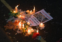
Meanwhile, everyone put on a brave face and behaved themselves for an evening and gathered outside the embassy on November 4th, (13th Aban – Iranian month), and got stuck into their favourite slogans and lit candles and sang and chanted and shouted some more slogans, and disapproved of each other, but it worked. For a moment I caught a glimpse of what an Iranian democracy might look like. Mottled and no mistake. The Communists were there – looking like something straight out of the British Museum, - really classy though, and they’re always so amiable and good-natured and thoroughly well behaved. The Sabz – Mousavi were out in force, which was weird because they are the ones that turn up least often. The Sabz – general-purpose-liberal-democracy-go-with-the-flow, we-don’t-really-want-an-Islamic-Republic-but-we-don’t-want-to-upset-anyone – these are the majority who come to almost all the demonstrations and who I know well, they were all there but a bit drowned out by the more pious ‘allahu akabar’ lot. And then a bunch of lefty ex-revolutionaries brought up the rear –generally in good spirits- and they too are demo regulars.
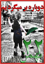
Things were very different in Iran however. The official parading of 13th Aban commemorates the storming of the American Embassy by Iranian students, so, true to recently established form, (see Qods day demonstrations, 19th September), the Iranian green protestors took to the streets in their tens of thousands in numerous cities across Iran, and called for the death of the dictator and the freeing of the political prisoners. They were beaten ferociously by Basiji for their pains but even so, the subverting of an officially sanctioned, government parade provides them with a bit more cover than they had during the days after the electoral coup d’etat. There are many more days such as these to come. I’ll try to keep posting.
My thanks as always to Iman Nabavi who takes the pictures and makes them available to all. Thanks to all who turned out to demonstrate and, above all, thanks and immense respect to the brave women and men, young and old, able-bodied and disabled who fill the streets of their cities in Iran and continue the fight for democracy against colossal and brutal odds.
Monday, 12 October 2009
Miss Haversham Gets Dressed: The New Ceramics Galleries At The V&A


Edmund de Waal once commented that, ‘ceramics have not been well served by museums.’ They haven’t. Museums have tended to view ceramics as historic objects. The meaning and purpose of contemporary ceramic work, which is sometimes exhibited alongside, is at best uncertain and at worst the whole lot is confined to the top floor of the museum, like the mad woman in the attic, disconnected from the rest of the museum’s displays, with few visitors and offering no meaningful dialogue with today’s audiences.
So, the ‘mad woman in the attic,’ the jilted or abandoned bride,- namely the V&A’s ceramic collections - has had a make-over. Someone has bravely attempted to sort out and make sense of the most colossal symptom of inflated imperial over-production imaginable. The V&A seems to have examples of everything ceramic that has ever been made or collected.
I am one of those few visitors that used to climb to the top of the museum, with flask and sandwiches and compass in case of bad weather, and spend hours gazing at rose-painted Chinese enamelware, and decorous Sevres porcelain. I’d stop, about half way up to adore the stoves, which had somehow escaped. I seem to remember them being on the next floor down, but I’m probably wrong.
The main thing is that it’s all still there – acres of it in new cabinets. Yes, it’s still all in cabinets. They haven’t gone that radical. Much of it is still crowded like Kings Cross on a rainy Friday. But you can still warm yourself on the stoves and gaze with love at the Andrea della Robbia leaning nonchalantly against a wall somewhere.
Pots At Work: Teaching Ceramics
The really BIG change is the teaching gallery. It has a real live studio where you can watch real live potters making things, like going to the zoo, only I don’t suppose mating in public is encouraged. There’s a reconstruction of a Lucie Rie studio – now this is interesting because the ‘studio potter’ is presented as an historical exhibit – so this must be the stuffed extinct animals section of the museum. The middle bit of this gallery, like a spine running down the centre, is a display of clays and glazes and all manner of ‘how to do it’ explanations and instructions. It’s brilliant. The best bit of the whole show is in this section. It’s called ‘under the sea’ (something like that). It’s a case full crockery that has been salvaged from wrecked ships that were carrying tea and the like from ‘The East’ and also carried chests full of crockery. It’s got bits of coral and you can almost smell the salt water and see the fish. It’s wonderful.
Contemporary Collection: The Ready-Mades
Finally – the other big change – is the attempt to exhibit the contemporary collection and connect it to the historic collections. Where they’ve mixed it up with the historic collections, it really works well. The teaching section has a several cases of contemporary work –mostly from Norway with a couple of particularly successful pieces by Paul Scott, (UK). These are examples of works where the artists are using ‘ready-mades,’ and they undoubtedly fare best in the V&A context. The overwhelming majority of the collections are made industrially - that’s just what people like to collect. So inevitably the work that is connected with the ceramics industry is in the right context. At last! These makers have not, in the main, been served that well by craft galleries.
Contemporary Collection: The Clay Pots
There ‘s also a collection of industrial based work in a cabinet in the ‘Contemporary Ceramics’ section and, again, you immediately sense it’s in the right place. The rest of the work still struggles for some reason. Ten years ago, someone asked me to go and look at the V&A contemporary ceramics collection and tell them what I thought of it. I said I thought it was an absolute disgrace. I remember being really horrified. It was an apology for a collection. Not only was it shockingly narrow, restricted to the worst kind of stoneware ‘Camberwell-Grey’ studio ‘vessels,’ it didn’t even have the best examples of those. It resembled the reject section of Oxfam – the stuff they put in boxes on the pavement and sell for a quid. It’s not quite as bad now. Modernist stoneware has expanded to the next phase of modernism, but it’s all still strangely soulless. From dirty modernism we’ve progressed to clean shiney modernism. They are now buying better examples of people’s work and certainly the industrial collaborations and readymade users are looking good – these kind of artists just make much more sense of the obsession with being clean, shiny and meticulous.
Signs and Wonders: Edmund De Waal, 2009 - He started this post so I’ll let him end it
Structure
The new, improved contemporary collection is displayed in a dark and solemn room like a tomb. It’s not a room as such, it is a wooden gallery - In the middle is a square opening. You can peer over the balustrade down into the entrance hall. The big lumpen mounds of fired clay which represent the truth-to-materials section of the contemporary work is arranged on a semi circular raised runway which embraces the gallery. The semi circle of the ‘stage’ – for such it is – the pots are spot lit in a brave effort to make them look more dramatic - connects it to the dome above. The bright white of the dome is circled at its base by a glistening red steel bracket. If you were to take a cross section of the bracket it would look like one of those square brackets: ] - like that. On the lower lip of the bracket are perched the white pots you probably associate with Edmund de Waal. The overall effect is slightly more elegant-interior-design-ish than I was expecting. I had imagined something that would look immensely precarious and a bit dangerous, with the pots stacked up to some height. It’s actually much more controlled than that, more arranged. The colour is magnificent. It really lifts the drowsy darkness lurking below – there is a lightness about the work, both in the sense that it is well lit and in the weightlessness sense, that provides a sharp and very welcome contrast to the layer beneath – where one half expects some of the crustier pots to start hatching.
What It Feels Like
The best bit is remembering to check from the entrance hall downstairs on your way out. You really can see it from the ground floor. From there it resembles the gums of some frightful hag bearing her chipped teeth at you. When you get closer, the chipped teeth turn out to be pots. They contain elements of various part of the collection so it is like a celestial meditation on the mighty imperial collection of collections.
Congress
One of the aims of Signs and Wonders was to connect the historic and contemporary collections and to embed it all in the architecture of the building. This it does very successfully, especially since it also connects the two, apparently disparate halves of the contemporary collection – the ready-mades and the carefully made, finely produced porcelain appear to have no connection whatever with the big beasts in the darkened cave. If you were to view it Marxist terms, it would be like trying to connect the lumpen proletariat – noble peasants toiling in the cave, with the petty, ever-so-refined bourgeoisie nestling in cabinets with tight lips. De Waal’s pots occupy the space which is exactly in between and which is somewhat under occupied at the moment. He still makes pots. They’re clay pots. They’re not obsessively clean and finicky and tidied up to within an inch of their lives – at least thy don’t look like they are – and porcelain seems to attract the most anally retentive of potters who just cant resist imitating the precision of industrial ware. De Waal relishes the wonky aspects of the material, its ‘mind of its own’ness, he certainly doesn’t do precious – well a bit sometimes, but not so it makes you worry, but not does he pretend he’s toiling in the mud. De Waal’s ‘collection’ is more like a conference of pots and they do succeed in unifying the two halves which is quite a feat.
Wednesday, 7 October 2009
Origin, The London Craft Fair, 2009


I didn’t expect to be assailed by the scent of lavender when I got to Origin, but I was – well it is a craft show after all - and a nice lady called Maxine Sutton has very obligingly, understood what craft is really about and made lavender bags and tea cosies, handsomely printed and sewn up like children’s sewing kits. They really are the business and the best bit is that the lavender bags have biologically in/accurate hearts printed on them. The heart design is the sort that shows valves and arteries but the shapes are traced in leaves in flowers. Brilliant!!
So Origin begins with a hint of the village flower show while being, unmistakably, a glitzy urban trade fair – a bit kitsch, a bit snazzy, a bit – well very naff at times – but proud. This is what works so well with this year’s selection, it seems much more certain of its own identity, much more confident than it has in the past. Industry is present but not dominant, it’s part of the process in conversation with the handmade or individually designed. This year’s ‘interventions’ use the ancient uber-craft discipline of basket weaving, - but this is post-modern basket-weaving, forget physiotherapy. I’ll write more about them next week, once they’ve had time to develop. Gone are the dark recesses containing ‘art’ as though it was something mildly unpleasant deposited under a lamp post. Origin, in short, has ‘come out.’
Jewellery, textiles of various sorts and ceramics dominate. There is a strong flavour of pink, lacy, girly feminine, - it’s a bit in yer face at times, splendidly tasteless, but a VERY welcome relief from the tedious thudding masculinity of ‘pure’ studio craft. Origin is altogether more promiscuous than it was: round the corner from the lavender you know there’ll be a bit of expensive cheap perfume. Someone made jewellery that looked like chocolates and presented then in pink sponge like fairy cakes. Ludicrous but very very effective.
Consistent with the extravagant cavorting of ceramics the other side of London, (in the Temple of the Applied Arts,) Sevres porcelain was a strong flavour in this year’s ceramics selection. Excessive, absurd, I’m not sure I really want to see it again, but it was fab just this once. See Kate McBride, Timea Sido,(second picture from top), and Jo Davies, for instance. At the extreme end of this is Jasmine Rowlandson – the Donatella Versace of UK ceramics. It looked tailor made for the Dubai market to me, but should do well here is she can reach the various diasporas to whom it will undoubtedly appeal.
This is not to say that ‘old fashioned’ studio ceramics has turned tail and fled. All of the above is ‘old fashioned studio ceramics.’ But somehow there’s more ceramic and less studio – its less noble peasant and bit more whorish – halleluja. A nice bit of anagama firing or similar would have provided a good contrast, but that kind of approach to making was conspicuous by its absence. It’s a relief not to see grizzly stoneware, but the swathes of pink gold and frills will pall very soon if its not balanced out with something a wee bit calmer. You cant live on marshmallows alone.
Chris Keenan, The Guardian Angel of Celadon Coated Tableware was there, representing ‘proper pottery,’ and also proving that celadon can still be tableware, it doesn’t have to be deconstructed to be desirable. Sue Nemeth’s Middle-European, folk-pottery inspired mould-cast porcelain, (picture top), brought all the strands together - very proper pottery, while also very pretty, feminine without being fetishistic, graceful, and very much her own vision.
Week one was seething with visitors within the first few hours of opening. That morning, Deborah Carre of Carreducker had received a Selvedge award. Now the presence of these shoemakers is something of a triumph. It’s a been a long time coming, The crafts Council, for decades, would have nothing to do with them. Not ‘pure’ enough apparently. But they, the CC, have now embraced design and collaborations with industry, so, with a bit persuasion from various people no doubt, shoemakers are at last allowed in. Carre’s stall looked magnificent. She had a case showing the tools of the trade as well as collections of beautiful hand made shoes. It was the proof positive of the confident, trade fair approach, a convincing exposition of craft as an industry in itself.
Subscribe to:
Posts (Atom)